36 DAYS OF TYPE
DESIGN
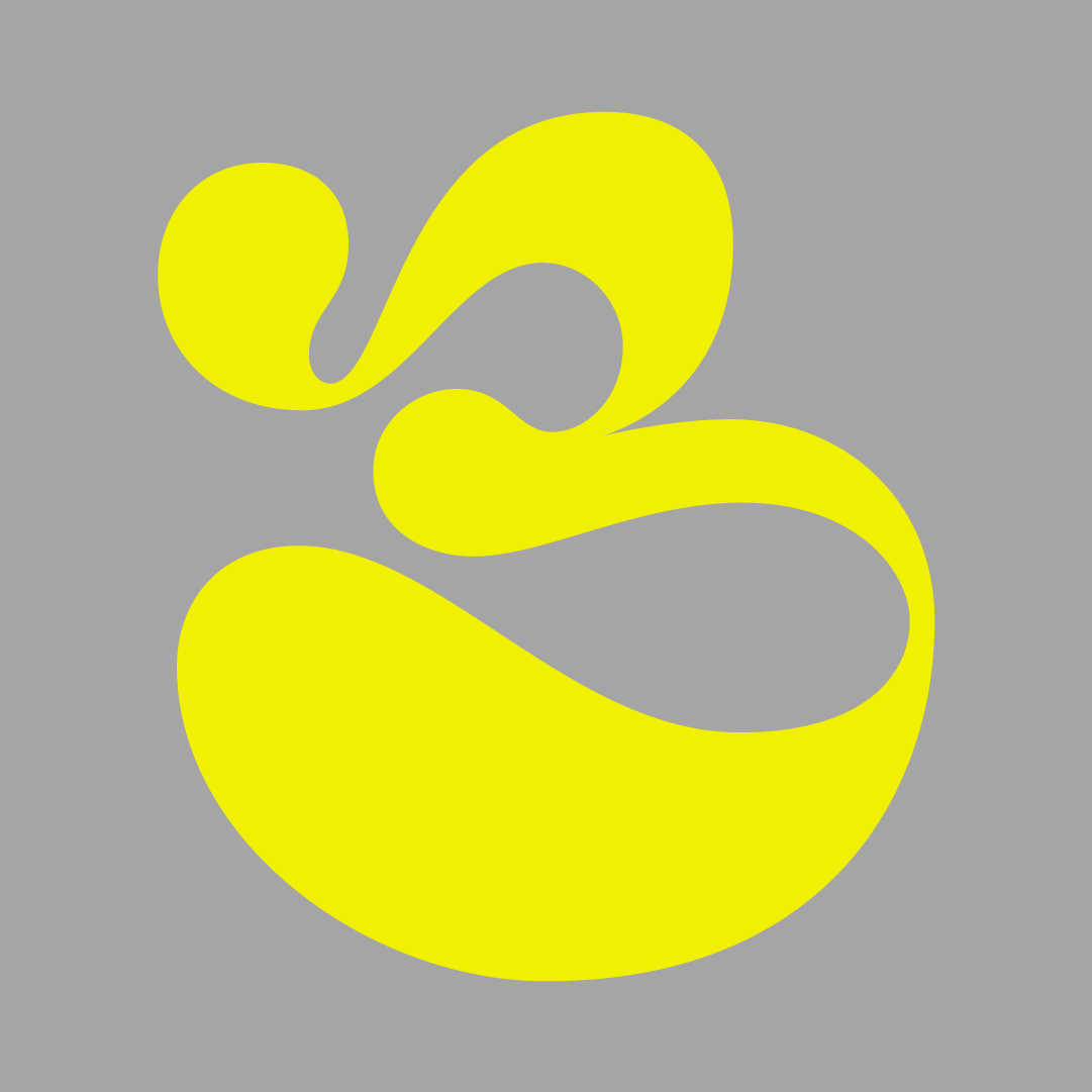
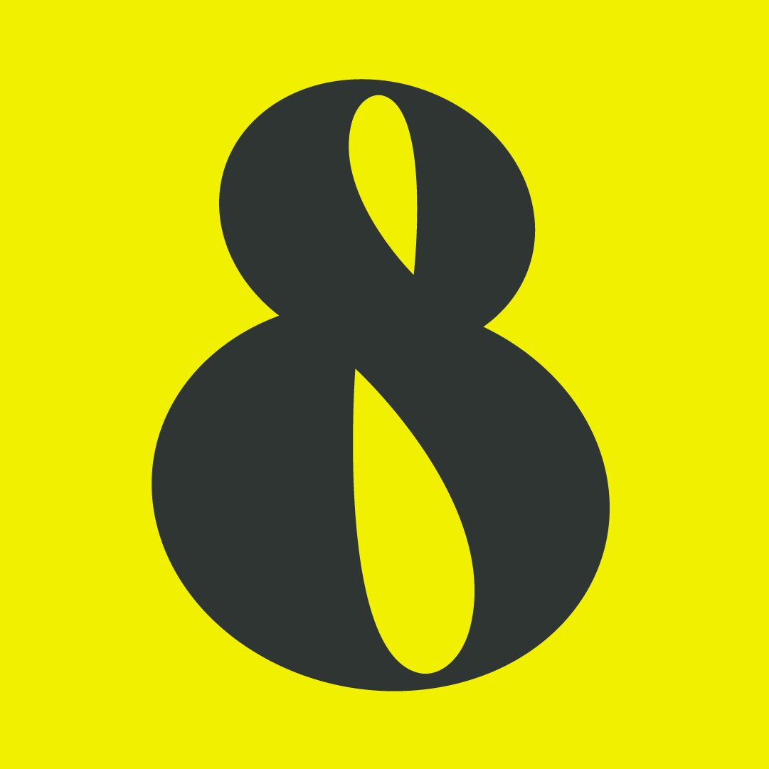
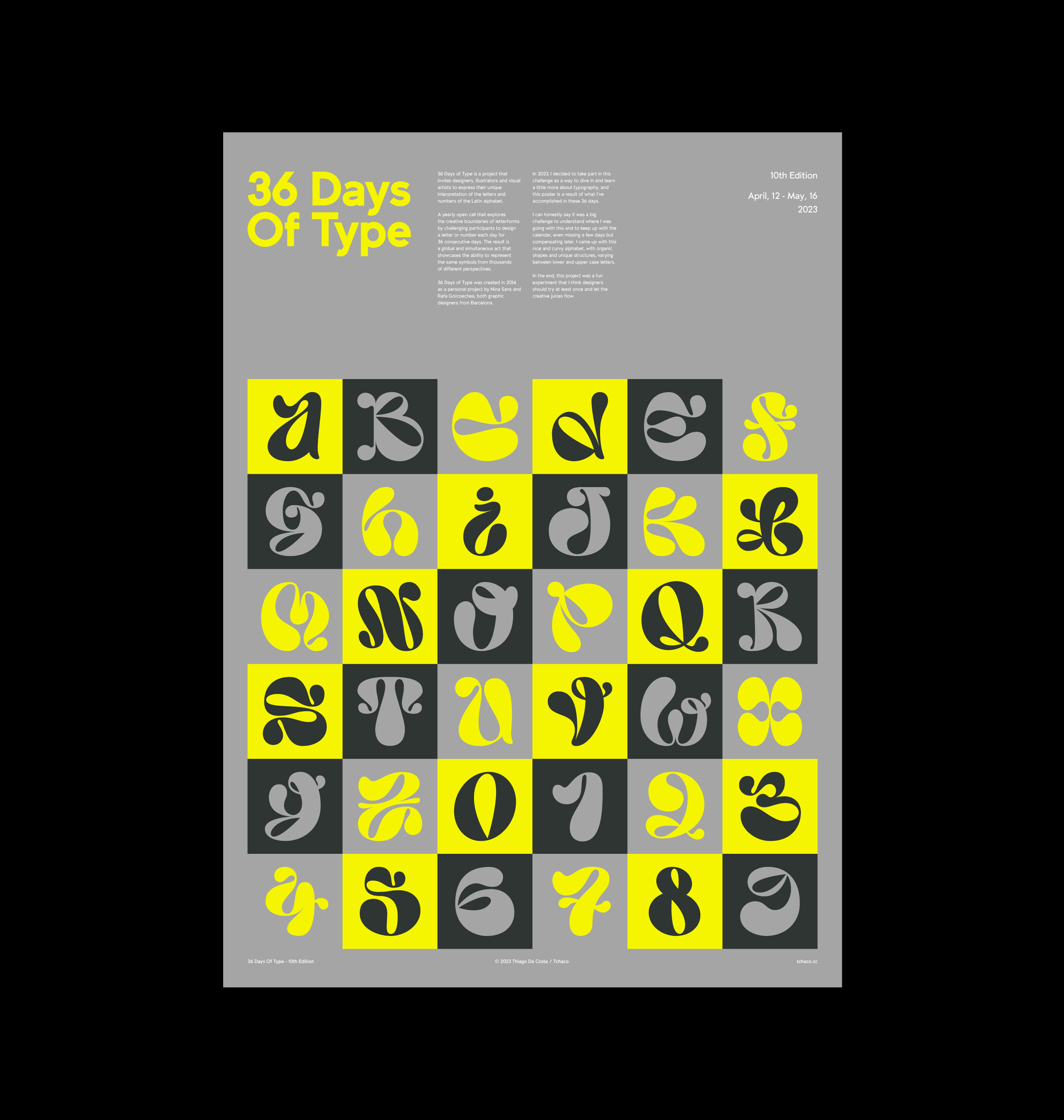
36 Days of Type is a project that invites designers, illustrators and visual artists to express their unique interpretation of the letters and numbers of the Latin alphabet.
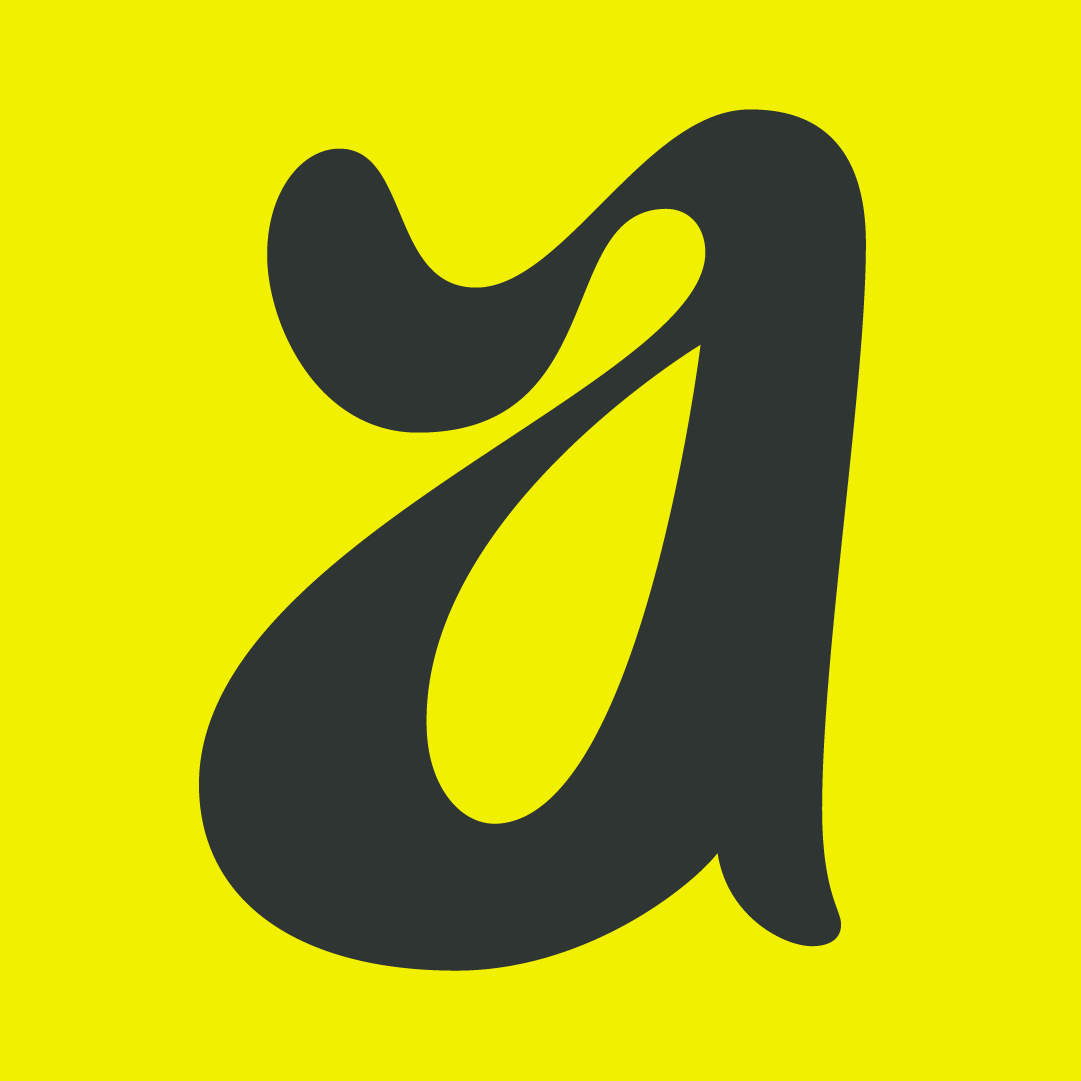
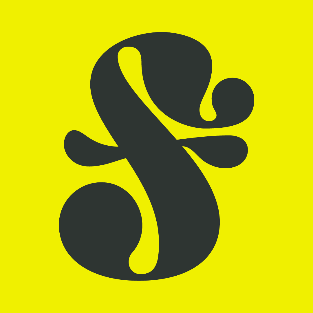
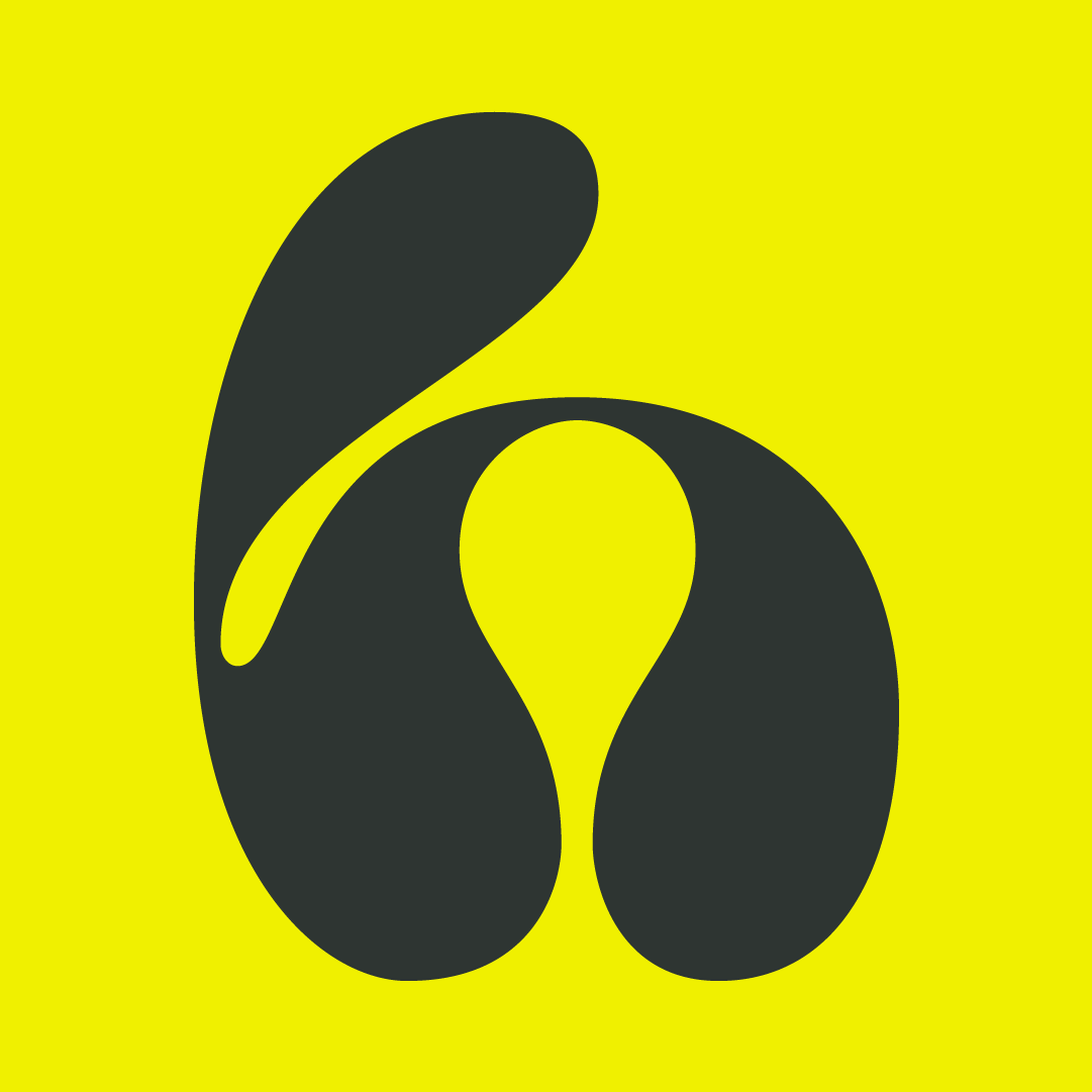
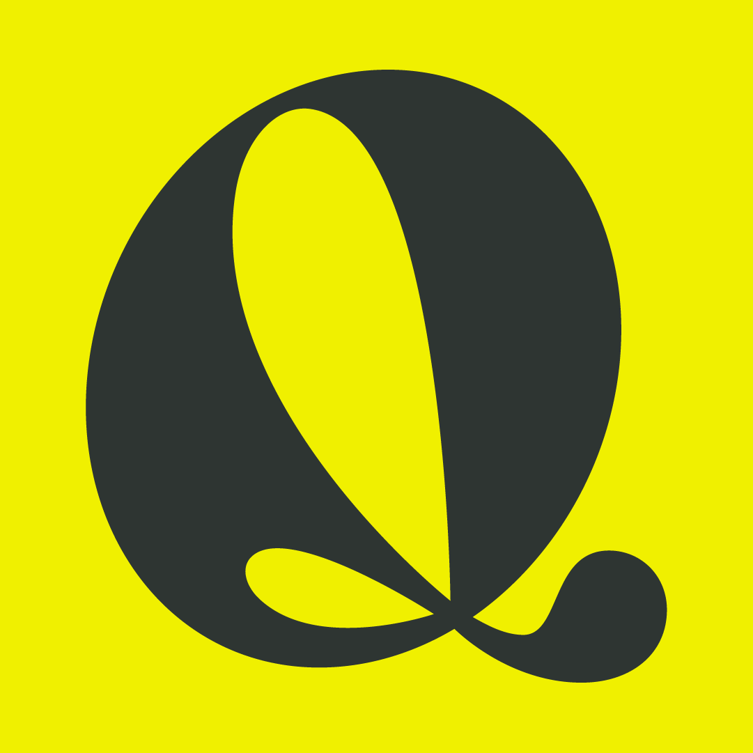
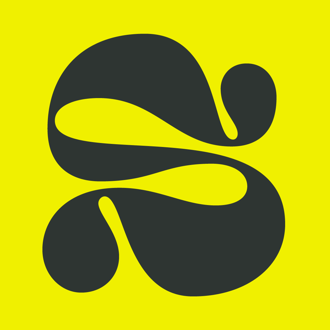
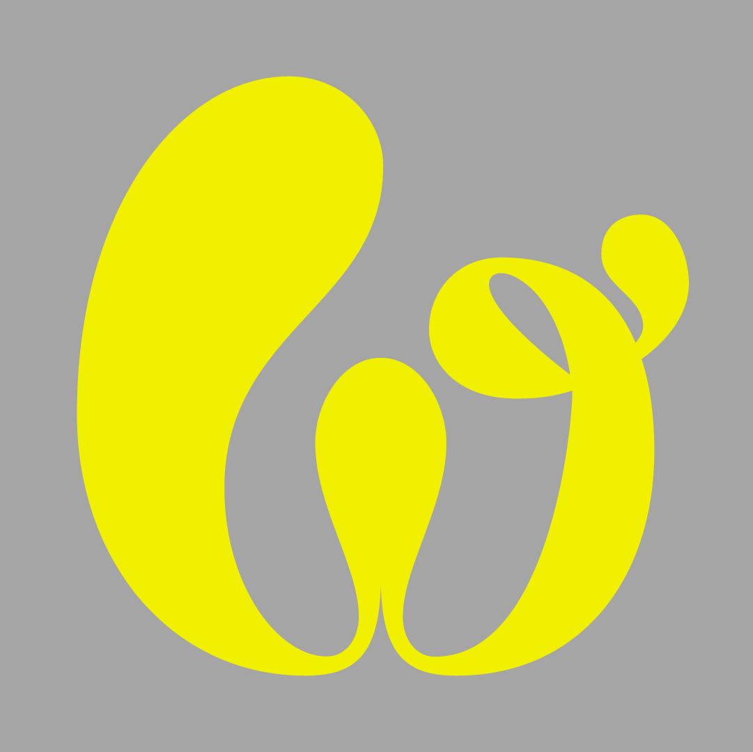
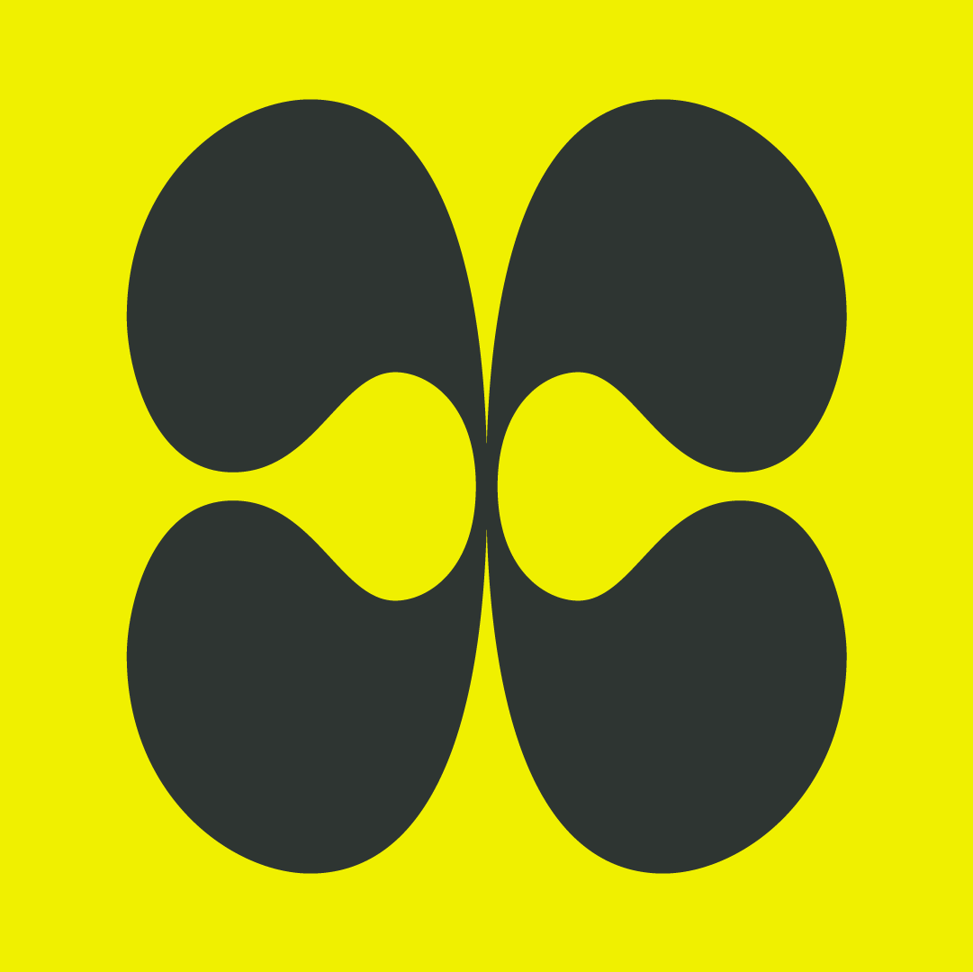
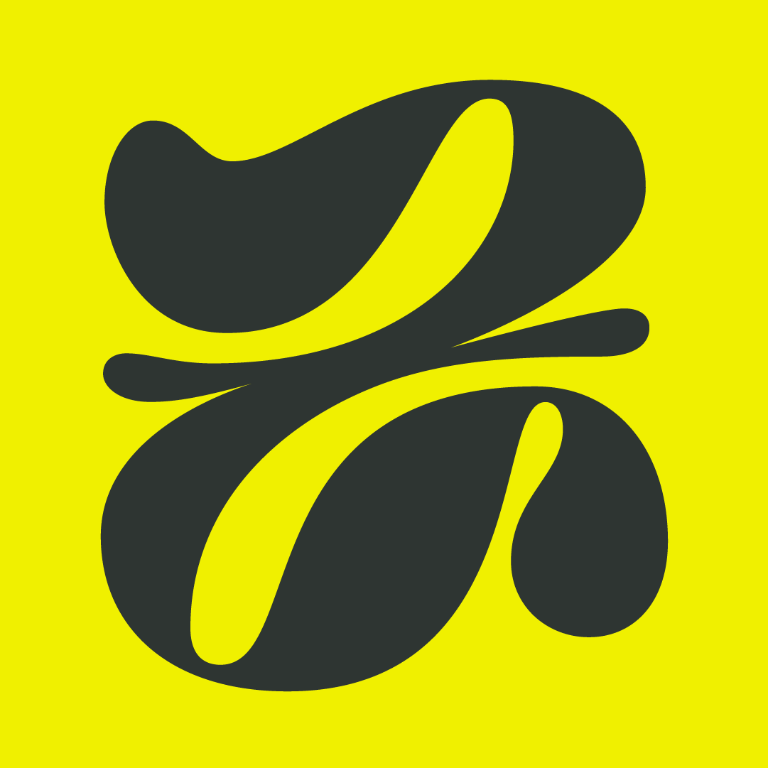
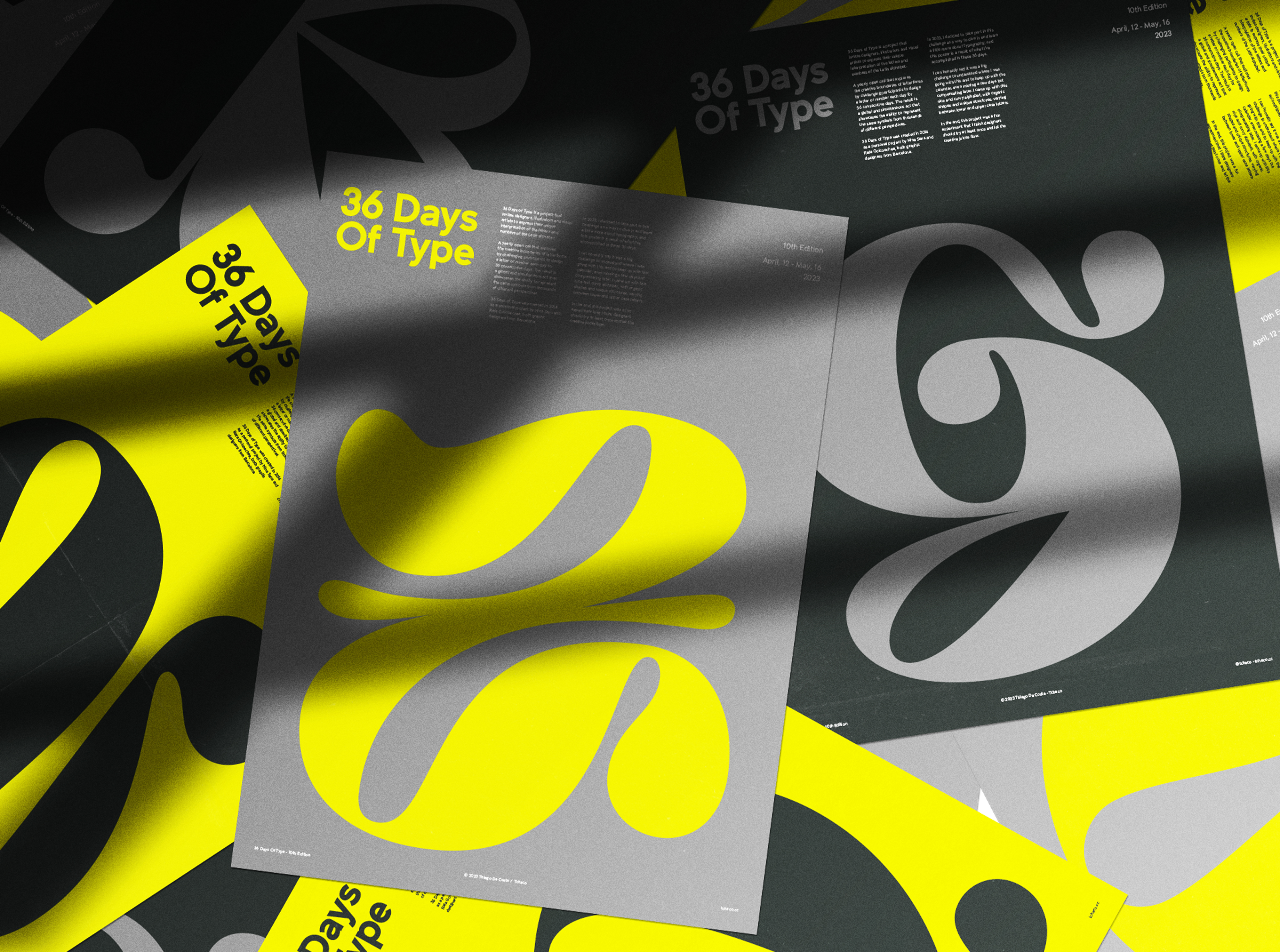
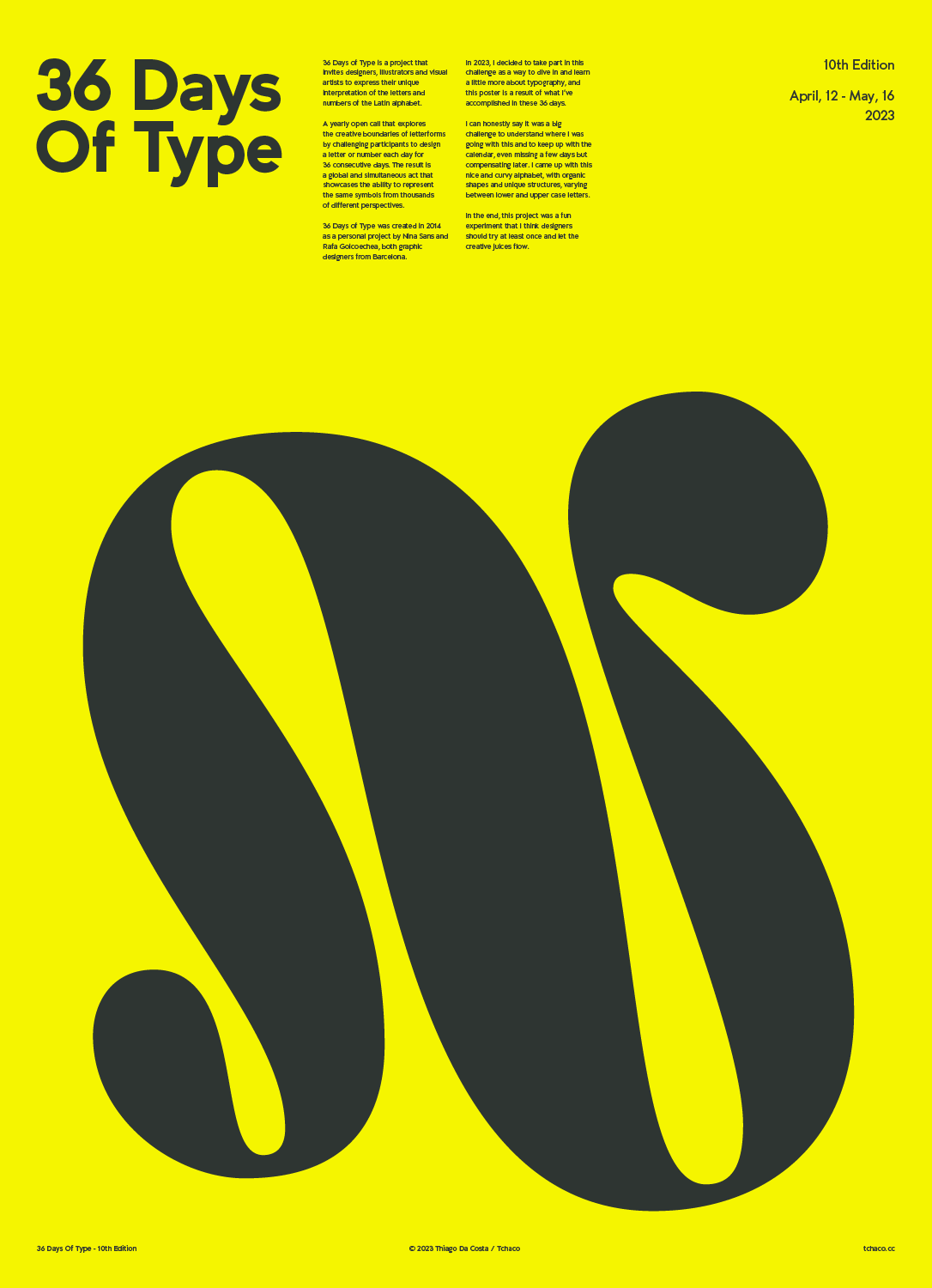
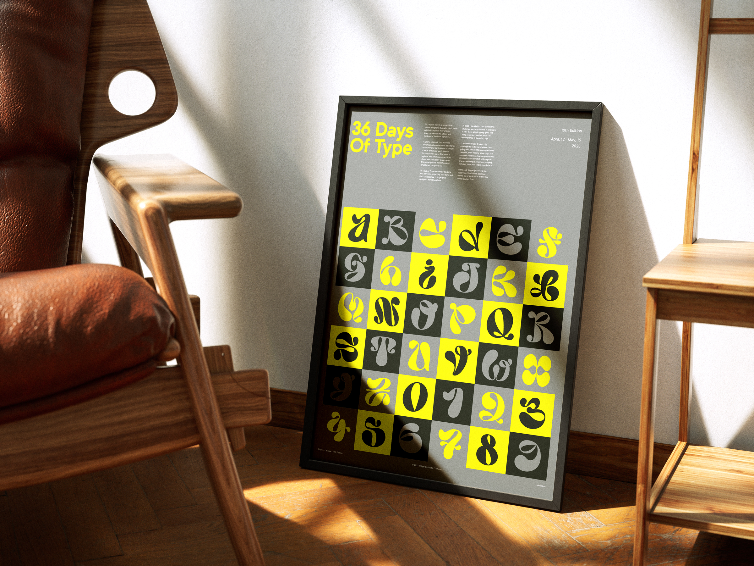
This year, I decided to take part in this challenge as a way to dive in and learn a little more about typography, and these posters are a result of what I’ve accomplished in these 36 days.
I can honestly say it was a big challenge to understand where I was going with this and to keep up with the calendar, even missing a few days but compensating later. I came up with this nice and curvy alphabet, with organic shapes and unique structures, varying between lower and upper case letters.
In the end, this project was a fun experiment that I think designers should try at least once and let the creative juices flow.

